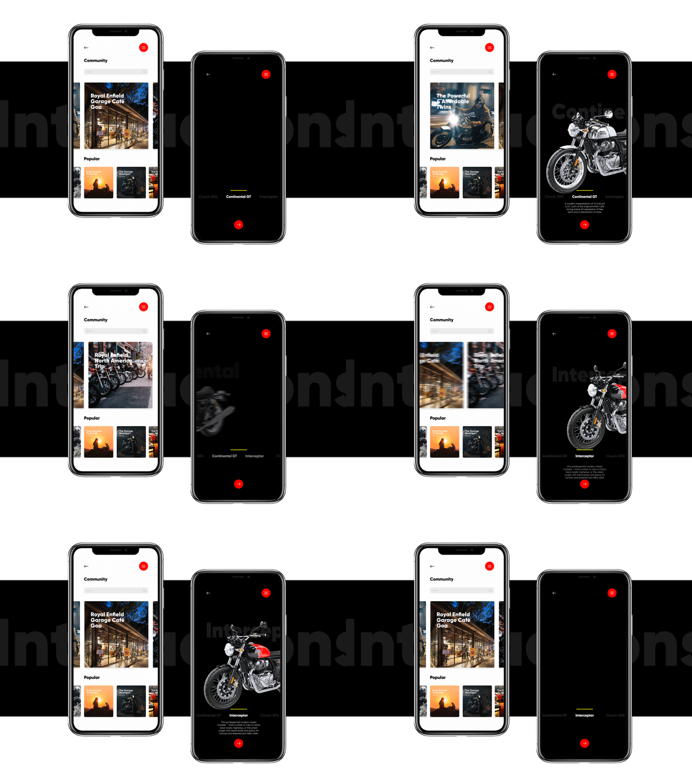
Royal Enfield - Mobile Experience
Check my works:
https://www.behance.net/mani27_2007
A personal digital design experiment to show how Royal Enfield’s current website can be optimized to meet current design trends. Being a die-hard RE fan myself, and have seen how RE branding has been keeping its roots with ‘Old School and Simple’. In my experiment, I have tried to tweak this to make it Bolder and Minimal instead, without moving away too much from the original old-school and purposeful philosophy.
The design and user flow aims at providing a seamless user experience on both mobile-app and the website. I dedicate this experiment to all the fan boys/girls out there! Also share your comments and reviews.
More by Manikandan Rajkumar View profile
Like
