Azienda Agricola Sansone Logo
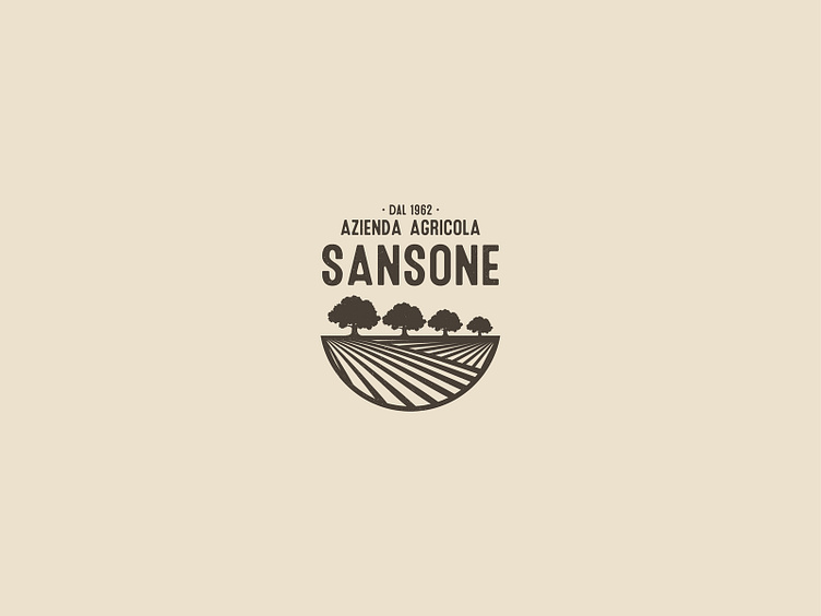
Azienda Agricola Sansone has an ientity now with this logo.
Concept: Land ⛰ + 4 Trees 🌳 that represent family owner in all this years, and then olives and almonds, the largest production of this area.
I adopted a single color, brown. Why? Because brown represents everthing in agricolture. Furthermore, design is making its way onto the monochromatic style. I love it.
Font used is Microbrew. A versatile retro display family. It's a nice mix between wood type poster style, and vintage letterpress.
What do you think? Let me know you thoughts in the comments. Cheers!
Press "L" to appreciate it
Follow me on: Facebook | Dribbble | Behance | Instagram | Linkedin
Get in touch at angeloavola@gmail.com
