Amazon detail page concept

Hi again,
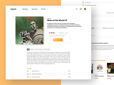
For a long time I have bothered how repulsive the UI of the Amazon.com website is. Sure the choices of styling components are probably substantiated by analytics, A/B tests, user tests, etc. but I thought I would give it take If I would be in charge of redesigning the Amazon website. I took the detail page as example.
The full width grid that Amazon handles works counterproductive. On a 2560 x 1440 resolution you get a stiff neck because it even uses the full width for text! I decided to use a 12 column grid for the intro of the detail page, and for the rest of the content a 8 column grid. This way you get a proper introduction with a good focus on the details. I really stripped the page and left out a lot of content. I think it really pops but still has a clean and organic build up.
If you appreciate my work, please hit the [L] key.
