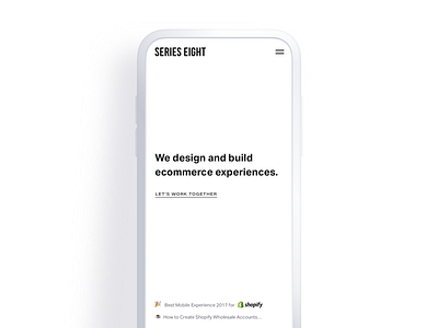
Minimal no-scroll homepage
This year (2018) Series Eight took on a new brand identity and website.
We focused on stripping things back with a super clean, minimal layout and lots of whitespace. We wanted our work and what we had to say to stand out more. Like all websites, it's a work in progress and we're constantly making tweaks and refinements!
Here's a mockup of our homepage on mobile
https://serieseight.com/
More by Series Eight View profile
Like
