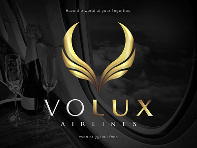
Logo Design: Volux Airlines (audition piece)
Logo Design | Branding
More Images: https://www.jasonullmeyer.com/voluxair
Logo that I was asked to design for a fictional, luxury airline as part of a project audition.Wings were chosen to represent flight, and were designed in the form of an abstract "V" for "VOLUX."The gold gradient for the mark was chosen for its connotation of wealth and luxury.The Florentia font family was chosen because it conveys a classical elegance with a more contemporary feel than a more traditional, serif font. As one online description aptly puts it, "Florentia takes its inspiration from the classic Roman monumental capital model of Beatrix, but develops the influences derived from the stone carvings in Florence Santa Croce Cathedral into a more contemporary overall design."Raleway is an elegant, san-serif font chosen for the secondary text because of how the shape and angles of the "W" in "WORLD" )two fill v's) compliment the "V" in "VOLUX," and the the V shape of the mark.
