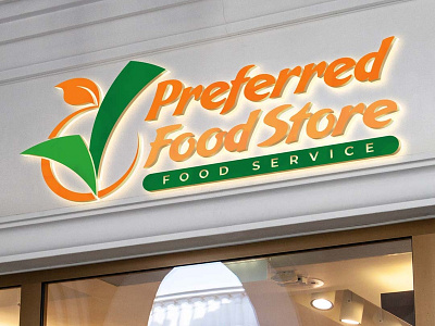
Logo Design: Preferred Food Store (contest entry)
Logo Design | Branding
More Images: https://www.jasonullmeyer.com/preparedfood
Design prepared for a logo contest on freelancer.com. Little information was given other than the name and tagline. I had the idea that preferred = check mark, and the thought of the check mark being the stem of a fresh piece of fruit followed quickly from there. I chose an orange because I wanted something round to keep playing with the idea of someone putting a check mark in a circle representing their preferred choice. Included in my entry were several different layout options and application examples for the logo. I did not win this contest, but I liked how this entry came out.
More by Jason Ullmeyer View profile
Like
