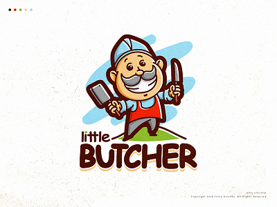
Little Butcher
This is an unused design proposal, so i decided to make something out of it instead.
I made some fun of the design and used a Comic Sans typeface and see if it works well.
By adjusting the kerning and tracking of the letters, modifications and adjusting the font-weight to harmonize with the illustration, for me, it looks really good.
However, everyone is entitled to their own opinion.
-------------
If interested with this design, just email me. Thanks :)
Youtube
Logopond
Instagram
Facebook
More by John Alocelja View profile
Like
