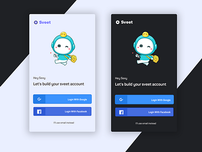
🔥🔥Mobile App Onboarding Screen | Dark & White
Currently creating login screen for my personal project.
Which version of the two looks better? Dark or White.
I would love to know what you think! 😁😁😁
Follow me on: Instagram
Want to work together? Contact me at hudixt@gmail.com
More by Himanshu Dixit View profile
Like
