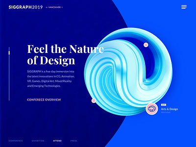
Computer Graphics Conference Website Design Experiment
Happy Monday!
What’s up? I’ve been learning Cinema4D lately, and this is a design experiment I came up with using visuals I created in this app.
That’s a website for SIGGRAPH 2019, an annual conference on computer graphics. The conference is really cool by the way, we visited it last year in Los Angeles, so I thought why not experiment on how a website for the following SIGGRAPH conference might look. Moreover, some unconventional design solutions, including some Cinema4D visuals, might be just what the doctor ordered for the website of such an event.
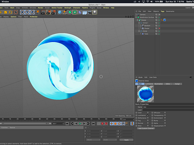
My goal was to make the website look vibrant and futuristic to reflect the conference’s innovative nature. You can see above what I ended up with. There are two more versions of the design in the attachment, I’d love to learn your opinion on which of the three is the best. Also, make sure to check the third attachment in which I share the process of creating the visual in Cinema4D.
Eager to hear what you guys think of this! Which version do you prefer? Do you work in Cinema4D? Share your thoughts! Looking forward to hearing from you!
Press "L" to show some love!
ᗈ Join our Newsletter! ᗈ Website ᗈ TheGrid ᗈ Spotify ᗈ Twitter ᗈ Medium ᗈ Facebook ᗈ Instagram


