Wikipedia Redesign Concept
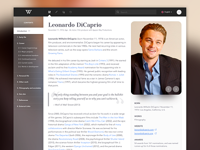
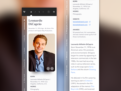
So, I took this challenge of redesigning a Wikipedia page because it looks too shabby and there is a lot of information right in front of your face which gets confusing. I hope I organized it and it looks clean. In the current design, you have to scroll to see the contents of the article, I placed it on the left which sticks even if you scroll down, so you can easily navigate between different sections. Mention your views in comments.
More by Akshay Salekar 🔥 View profile
Like


