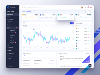
Cryptocurrency Dashboard Redesign (Free Download)
A redesigned dashboard for my current project. The name "Coinspace" is completely made-up. Contact me if it offends your copyright.
As for the redesign, here are my design insights:
1. A dashboard is the first page the users see after login. It should contain enough information for the users to get a general idea of what is happening in the crypto market; leave as fewer CTA buttons as possible because this is just a dashboard, the main actions will be taken place on other pages that are well categorised in the side menu.
2. Place the only CTA button "BUY" close to the coin list. This allows the users to use minimal mouse tracks to navigate through two of the most important sections on this dashboard.
3. The main area is responsive-design friendly. I used grids for all the sections, when view on a mobile device, sections won't break awkwardly.
4. Consider the users learning curve, I used a lot of icons. It takes time for the users to memorise which icon means what, but I designed the icons to be comprehensive enough, most users should be able to understand what it means at their second click.
5. All colours are adjusted for Type P and D colour blindness. Accessibility design is essential.
-------------------------------
Find me also on Twitter and Medium. I published a little article for Prototypr.io about Design Sprint and Storyboarding, be sure to check it out if you're interested :p Happy design everyone!
https://blog.prototypr.io/choosing-a-winner-user-flow-for-your-storyboard-a2cb22d51320

