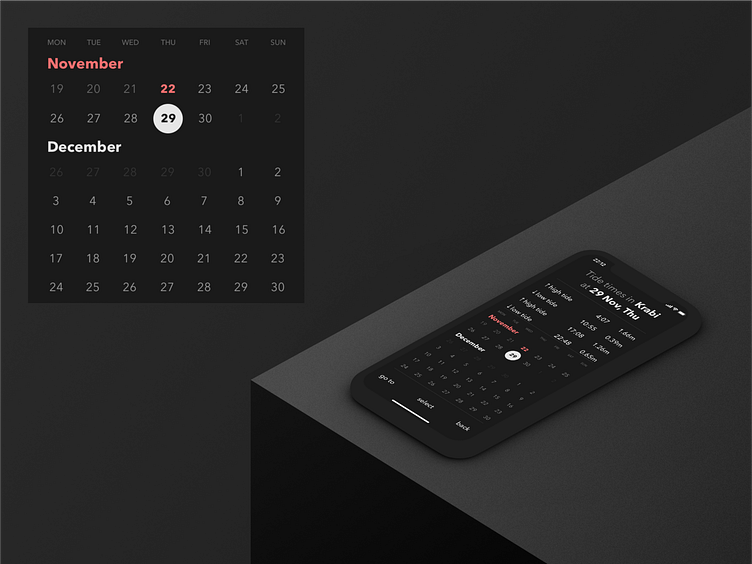
Tides app concept. Calendar view. Dark theme.
Detailed calendar view in dark. Low contrast should be easy on eyes in the night time. I emphasised selected date and today. In the header emphasis is on current location, selected date and day of the week. The point is for the person planning the trip to the beach to understand at a glance when it would be better to come. As always, I welcome all critique, comments and likes (:
More by Dima Veremchuk View profile
Like
