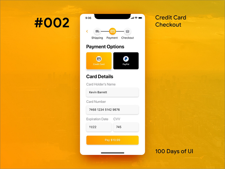
100 Days of UI - #2 Credit Card Checkout
#2 Credit Card Checkout Day 2 of the 100 day UI challenge and I designed a mobile checkout screen. My focus for the UI was designing appropriate grouping of information and using bold colours.
More by Brian Agar View profile
Like
