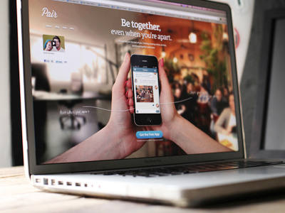
Pair's new homepage
the idea of pair is pretty neat, an app for just two people. it's really no different than anything else out there other than the fact that it's a more intimate experience between you and another person. which is a solid idea.
pair reached out to me in need of a really good homepage. they didn't want something like every other boring homepage that just shows the product on white or something. so, i put my creative thinking cap on, grabbed my mark ii, a tripod, and my wife and we went to a cafe and shot some pics of us holding the phone together. came out rather nice.
the idea here is that we are both in the same app, on the same page, but in different locations - hints the 2 different bg images. one is me in the office and the other is her at a cafe. "be together, even when you're apart."
check out the slightly larger size attached for slightly more detail.
pair did a rush implementation of it here http://trypair.com (and moved things around, changed font sizes).

