Car Website
Hey guys,
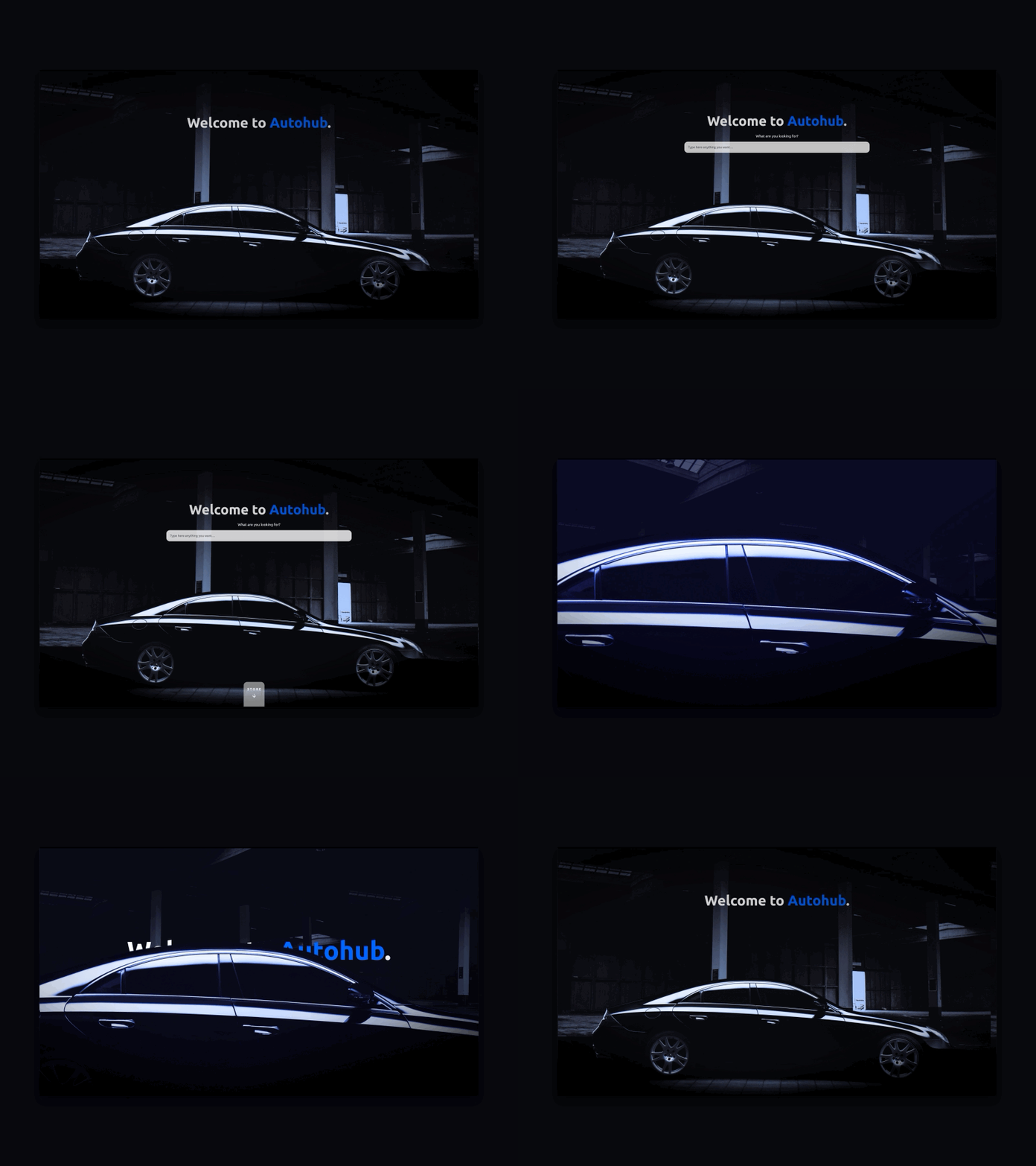
I often like the light and white themes, because it's peaceful and minimal. but in this case, exceptionally I used the dark theme, black and our main color, Blue! because it's too classic and luxury for cars. you know? anyway! this shot created for our new website and it's #MadeWithAdobeXD auto animation.
I hope you like it and don't forget to press "L" 💙
More by Siavash Ghanbari View profile
Like
