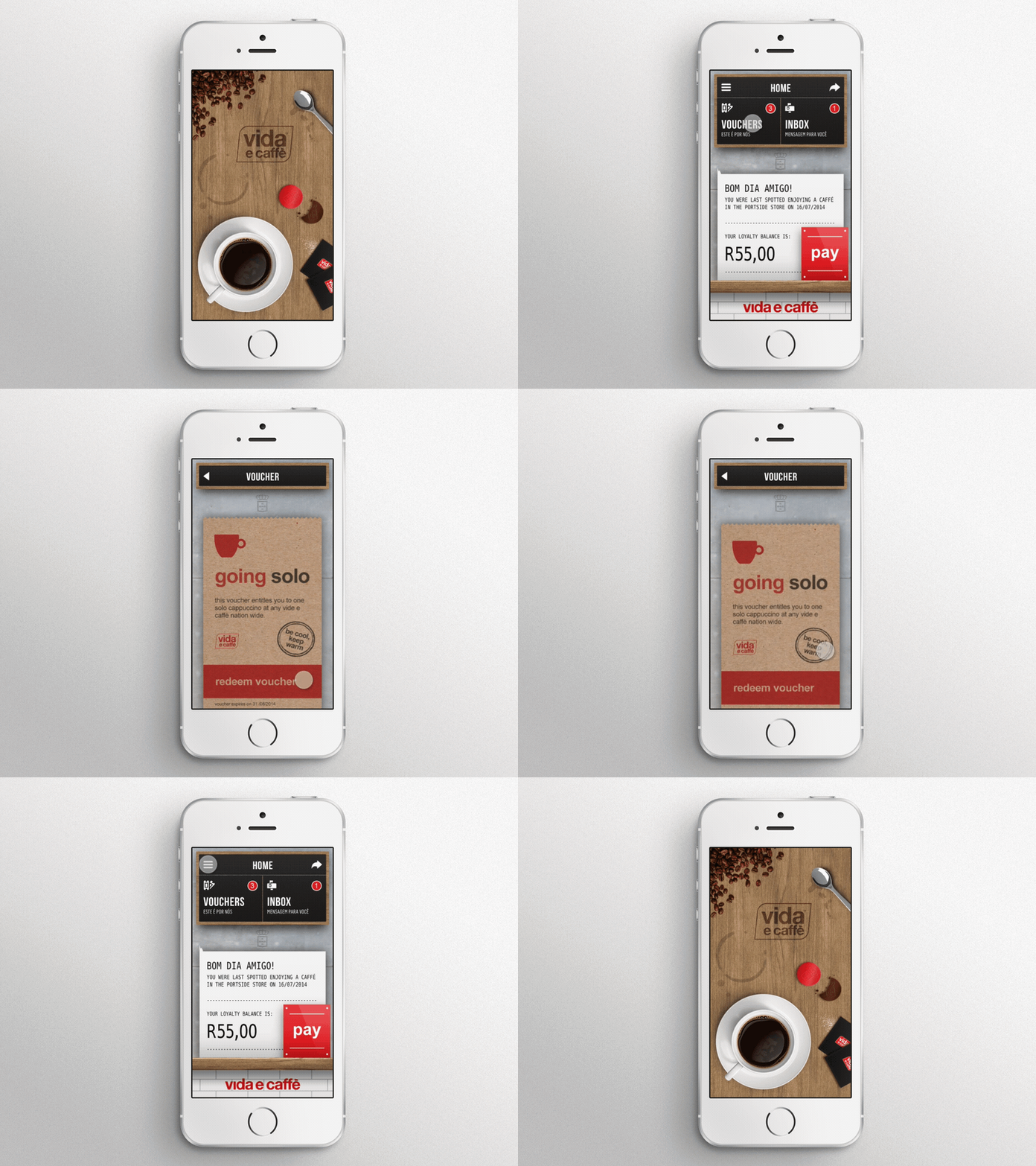
Vida e caffè Skeuomorphic App Concept
This is a throwback to an early-stage concept I did for the vida e caffè app back in 2014. At the time, the skeuomorphic design trend had died, but vida had just revamped the look and feel of their stores, and after doing some in-store research, I came up with the concept "the app is an extension the store". I love skeuomorphic design, it's what attracted me to UI design after all, and I really wanted to bring all of the new materials and textures into the app. I went to town with the detail, and had a blast designing this. Check out the attachments for some screenshots.
I don't have the original Photoshop file, so unfortunately I couldn't animate each layer. I had to work with a flat screenshots and 1 or 2 assets I'd originally exported.
A side note: I originally built this prototype in Quartz Composer & Facebook's Origami plugin, and it took me 2 days. Granted, I had to learn how to use the program, but 2 days is an absolute age compared to the 15 minutes it took to rebuild it in Flinto. I'm so thankful for tools like Sketch and Flinto which make my workflow a breeze compared to 5 years ago.
==
Check out some more of our work here:
Behance - https://www.behance.net/roundthecorner
Instagram - http://instagram.com/roundthecorner_design_co/


