Ugartebeer vol. 1 cap design
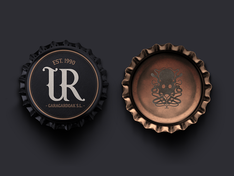
With this proposal for a graphic brand, the origins of beer have been reached. Since the Basque Country is located on the coast, it was customary to transport cereals by the sea in the pirate era creating a series of myths and legends. To conceptualize the idea of adversities that have been overcome to bring the brand forward, we have come to the representation of several sea monsters that, after opening between the different obstacles, they would be defeated to achieve a successful outcome.
The colours used have been chosen thanks to the union between the sea, the darkness and the tones of the old distillers. The color copper has been used to represents the tradition, the craftsmanship and the colour of the beer. The black one has used in the lager version and symbolizes mortality, prestige and mourning. The navy blue has been used in the IPA version and represents the depths of the sea. Finally, an eggshell tone has been used to create dynamism and contrast between the two versions. (This is a class practice, it does not correspond to the original mark)
