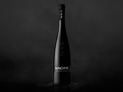
Naomi
Traditional plum aperitif was given the name «Naomi». This is the way the most graceful girls are called in Japan, which means "the beauty above all". The beauty of plum blossom inspires the poet on poems, and the winemaker on creating Naomi – a true plum masterpiece. It is the beauty and harmony (of life, nature and taste) that provided the basis of the new brand philosophy.
Krylia FMCG Branding developed the slogan and the brand legend of Naomi, wrote a true Japanese haiku, created several promotional copywriting projects for brand-building in the mass media.
For plum wine the delicate elegant bottle was developed. Embossed characters on its frontal plane correspond to the Japanese writing of the word Naomi. Stylistics of the labels has symbolic elements of ume (Japanese plum), blooming with fragrant white with red tint flowers at the background of the blue-black tree bark. Rigorous and, at the same time, elegant logotype, and "clean" contrasting colors, typical for Japanese painting, formed the basis of Naomi corporate identity.
At the second stage of the brand development a 15-second promotional video "Delight" was created (directed by Igor Stekolenko). Based on the video the advertising images were created for the print media and Internet.
