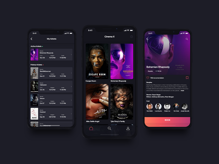
CinemaX iOS mobile app
Check full case study on Medium https://medium.com/@vladimirjanjevic/cinema-ios-booking-app-case-study-4dc650870261
- Overview CInema X is a mobile app that makes it easier than ever before for people to buy an reserve cinema tickets directly from their mobile phones.
- The Challenge A common complaint about going to cinema is that people do not like when they need to wait in the line for buying tickets, beside that they do not like when they got bad sets position, and the worst scenario is when tickets got sold. So in resolving this issue, my goal was to create an application that connects users and cinemas in the direction of avoiding the above problems, with the possibility that the user can select the desired movie, choose the desired seat position and easily pay the ticket through the application. This whole process needs to greatly improve the entire user experience which should lead to new users in the direction of achieving business goals.
- Personas As part of the research phase, I created a snapshot view of the target audience. The user goals and pain points helped me to gain a better understanding of the problem we were solving.
- User journey map Based on the persona insights, I started to breakdown and map out the different user needs and goals by turning them into customer journey story. This helped me to further define the products scope, as well as the functional requirements and features.
- User Task flow My next challenge was to examine and simplify the number of steps needed for each user to complete their key tasks within the product.
- Wireframes Based on my initial sketches, I created a set of mid-fidelity wireframes. In doing this I was able to map out the bare-bones of the app, including some of the more subtle aspects such as element spacing and dimensions, identifying reusable patterns and setting the typographic scale.
- Wireflows Next, I was created a set of Wireflows to document the more complex micro-interactions and conditional logic behind the apps dynamic content. I also created a clickable prototype to test the validity of the flows.
- Visual Design My goal was to create a highly esthetic and intuitive bridge to maximize user experience and overall product performance.
