VaporyShop Wordmark - Online Vape Store

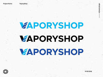
Three different wordmark variations for VaporyShop.
Bringing all the logo and type components together to form one design. Perfect for a storefront.
The gradient of the middle design was also implemented to reflect the heat/fire/electricity that you feel and create when using a vape.
With blue being the hottest part of the flame, we felt it helped take the brand one step further ahead of their competitors.
Interested in working together or purchasing a logo? Send me an email at hello@connorfowler.com or visit my website https://connorfowler.com