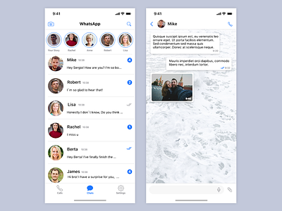
Whatsapp For IOS Redesign
The main goal in this redesign challenge was to make status option more popular between the users of the app, for this challenge I thought the next solutions:
- Include the option to see the status uploaded for a user clicking on the profile picture of the chat with that person and don't change anything else.
- Include the option to see the status uploaded for a user clicking on his profile picture in the main menu and delete status menu option.
-Include a top bar with all people status and delete status menu option.
-Include a status bar between conversations and delete status menu option
Finally I decided the 3rd option becuase it was the one that can be more used due to being on the top of the app, also we decide to make it more minimalist in terms of color.
Comment down below if you like it or have any suggestion ❤️
