Spitali Lindja
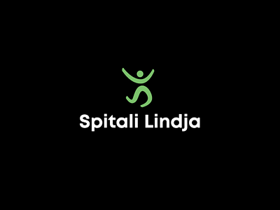
First by incorporating two initials (S&L) we created a new icon of a man that is in state of happiness. We tried to find the best position that man can show emotion explosions (usually synonym for birth of a child or just when you have a good news). At first glance the happy jumping man transmits positivity, succeed, bright life that increases furthermore the credibility in healthcare services provided by SPITALI LINDJA.
At the same time the logo buildup even more character, if you concentrate in upper part “L” initial and “HEAD” we visualized a sunrise figure (the sun in between two hills) that represent the new day, new life, new beginnings nevertheless it is a visual translation of word LINDJA (Alb-birth, rise, new) by allowing us to have even larger use of the logo.
The spirit of green color with a wide spectrum of meaning( Harmony Freshness Safety Fertility ect.) stayed untouched in logo.
Hence, by redesigning the logo and incorporating new elements in logo we build freshness, liveliness, a modern spirit all lined well with the past identity and binded well with the philosophy of “SPITALI LINDJA”.