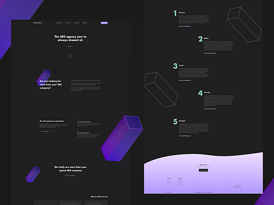
Dark UI for SEO company
Feeling boxy!
We went for some dark UI for UK based SEO company Pandable. We took inspiration from the split up "e" in their logo, and transformed one of the lines into a 3D block to add visuals to the site.
See it in action here: https://pandable.co/
More by Series Eight View profile
Like
