Exploration Design | Choose Genre Preferences for Music App
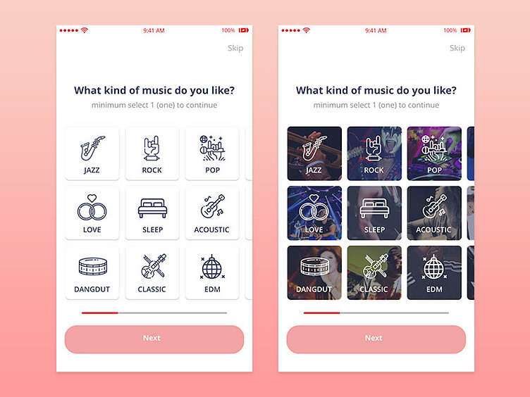
Which variation do you like? right or left?
Before answer the question, let me tell you a story. This is screen for music application project that I have been working on.
After the user completes the registration stage, the user will enter this screen to choose the type of music they like. So when the user enters the home page for the first time, there is already a music treat that suits their tastes.
To approach the appearance, I made 2 styles. The first style is minimalism, I only use the icon to approach the type of music using color according to the brand guideline.
The second style is the improvement of the first style, where I add background images that match the type of music. So I expected, the user can feel the description of the type of music through this approach.
So let me hear your decision, and give a feedback is a plus :)
*Thanks for @Purnomo Aji & @Theresya Mega for the invitation, so i can make my first shot.
