DailyUI :: 010
Hint: Design a social share button/icon and be mindful of the size, imagery, placement, and purpose for sharing.
Process: I stayed late at work on my last day before vacation to get this done. I'm dedicated this time, promise.
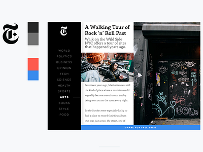
I saw a ton of share tools that are animations and a lot of fun, but that's now what I'm trying to do. Played with the idea of making a share get you a free trial or subscription. We have been talking a lot about upgrades at work, so tried a new look for it just to explore a bit.
I also used some colors I thought got a bit underutilized on the New York Times site and I think they look nice together. Isn't the NYT branding just great by itself though? I love it.
More by James View profile
Like


