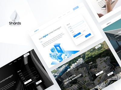
Rental Management Landing Page
Stop me if you’ve heard this one: designers and developers splitting hairs over their two worlds colliding 😠
Rings a bell, doesn’t it? Inconsistencies between design and development are a plague in the community 💬
But what if there was an easy way to fix it? Like, say, using preexisting frameworks?
With this shot, we’re starting a little series that came together as a result of one of our design challenges: using readily available frameworks and UI kits to create great designs. Here: same Rental Management web page in different reveals built with Shards UI toolkit.
Let us know what you think, and remember that frameworks are your friend. Don’t let them limit your creativity; make full use of them, instead! 😎
---
Thanks for checking out our stuff!
Feeling inspired? Get in touch!
We're available for new projects
ux@stxnext.com.
Want to join the team? Let us know!
We're always on the lookout for new talent at STX Next.


