Ciptareka Digitama Logo
Ciptareka Digitama is a startup company that comes in mid-2018, they are a company that contains young people who are smart, tough and urgent with bright ideas.
Ciptareka Digitama is engaged in IT support and network technicians, they work on networks using standard Mikrotik networks.
Apart from their focus on networking, they also serve post, photography and videography social media creation.
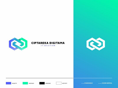
The construction logo from Ciptareka Digitama is a combination of letters C and D which are combined in an infinite form. which has the meaning of continuous business turnaround, relentless creativity continues to spin.
The colors used in the Ciptareka Digitama logo have 2 basic colors, namely Blue and Green. Blue which means technology, sophisticated, modern. Green has the meaning of growth, life, environmentally friendly, fresh. It can be concluded, the meaning of these two colors is technology that continues to grow
See full my work: https://www.behance.net/gallery/72778881/Ciptareka-Digitama-Brand-Identity