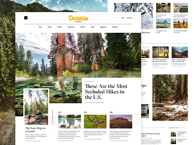
Outside Magazine Homepage
One last piece of the Outside Magazine redesign concept to show is the homepage concept. I loved working on this project as I really enjoy editorial design. It's the type of project that calls on strong typography usage attention and pairing that with beautiful photography.
Take a look at the full pixel layout for all the details
The goal was to create a high level of interest through the different type of content blocks while maintaining a clean and magnetic minimal feeling as you scroll through the homepage. I've stripped the ad blocks on this page too for presentation sake here (obviously unclutters to remove) but all those needs have been thought through as well.
Take a look at the other pieces of the project as well that tie into the style and feel set on the homepage:
All photography materials have been used only as example placement only, and all rights belong to the respective owner(s).

