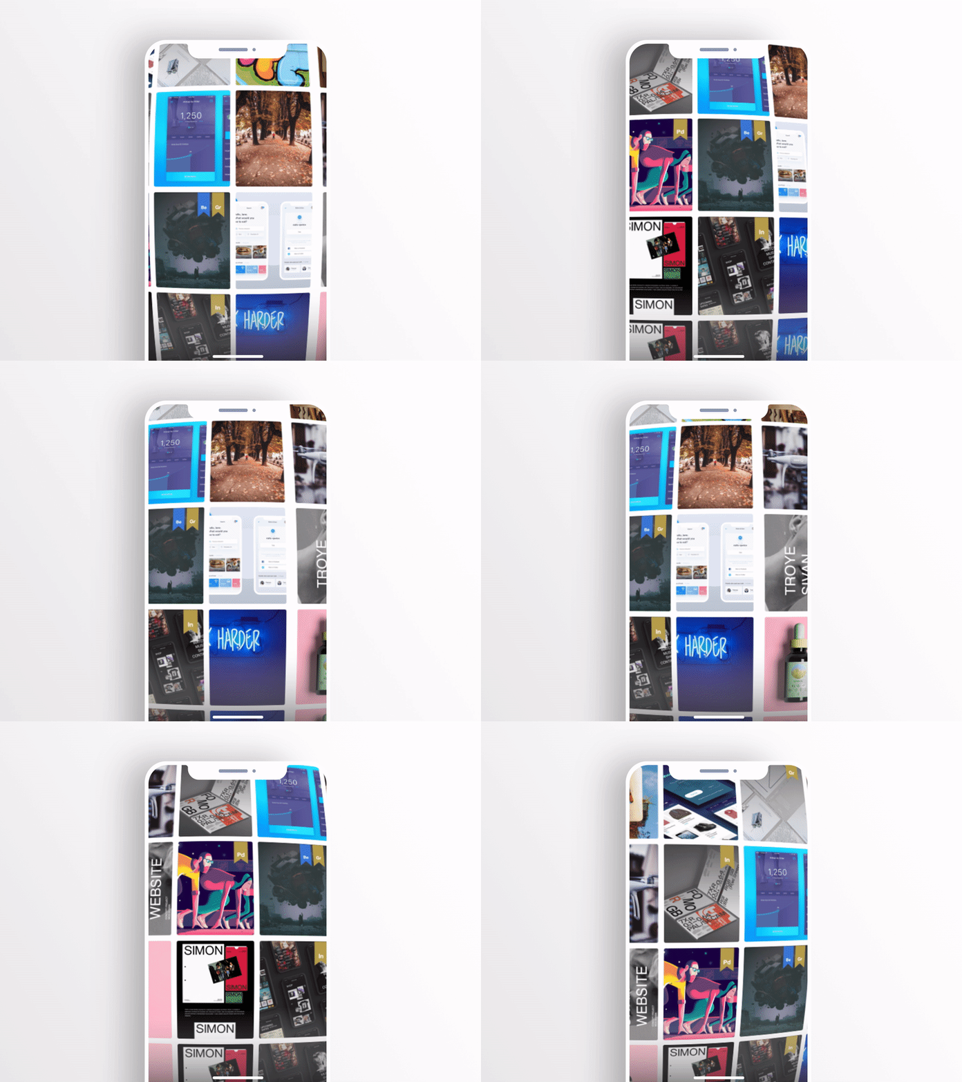
New Behance home screen navigation Concept!
I thought that this concept combined with infinite scrolling in each direction would be really nice for a random inspiration page or specific search results. Although, you can use the button at the bottom of the page to switch back to the classic homepage:)
In this shot, I was trying to re-imagine a brand new navigation design for the Behance homepage on mobile devices. I called it Behance Universe. (Inspired by the sphere tool in AE)
I designed the new concept in XD and used the AE export feature to deliver the sphere animation.
After my last three shots that were completely developed with auto-animate, I wanted to come up with something more advanced using the XD/AE export tool. Hope you guys love it :) @Adobe XD
Still plenty of room to improve but once again became so powerful and fits very well in agile work environments.
My takes and suggestions. Hopefully, helps the future updates:)
1- The auto-animate concept is great and super fun and easy to use. I wouldn't be suggesting adding a timeline because I feel that would kind of defy the auto-animate concept but adding a spline graph editor panel in which the users can gain more control over the easing process without dealing with keyframes or properties.
2- HoverState presets for icon and passive scrolling animation.
3- I think that wouldn't relate much but consider it as an ambitious thought, adding a perspective grid that can be activated while rotating elements will be great. It doesn't have to be as advanced as Ai or PSD, but having it alongside the rest of the auto-animate features will really add up to the experience so that I won't need to leave XD, create my shapes in different motion, importing them in, then start auto-animating. Having a simple perspective grid in auto-animate will help to take the whole animation experience to another level.
Glad to participate in this quick contest :)

