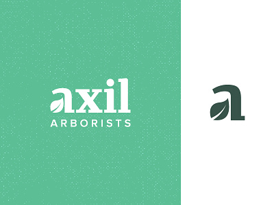
Axil Arborists
Recently designed this logo for a friend's tree surgery business. Leading up to this design, I had a bunch of different sketches and ideas but nothing seemed to stick or look neat enough. Initially, I set out with "Axil" and "Arborists" on the same line at the same weight, which seemed too much to digest and a bit of a mouthful. We then spoke about "Axil" being the primary company name with "Arborists" as the description of their service below it - much better.
An "Axil" is the upper angle between a leaf stalk or branch, so it was pretty crucial that I included some sort of leaf in my design. A great name for a tree surgery company.
Once I landed on this general idea, I originally had the leaf in the negative space within the loop of the double-storey 'a'. Putting that into practice I quickly realised that the leaf wasn't large enough and needed to be more prominent, so I decided to turn the loop itself into a leaf and I'm pretty happy with the results.
The "Axil" type is completely custom drawn, but is based off one of my favourite serif fonts, Merriweather. Using that font to start, I ironed out some of the lines to be more straight and precise. Merriweather made for a great foundation and will work really well as the primary brand font.
The intention was to have a main logo and a mark which could stand on it's own, where the mark could be displayed on the front of a t-shirt with the full logo on the back, for example.

