Triodos UI Explorations
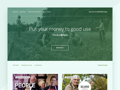

Triodos, a European ethical bank, approached cxpartners to produce a suggestion on how to modernise their existing website, which is outdated for the current market.
I made a number of suggestions including a total revamp of the use of colour, form, and typography, each of which felt over-complicated and bland when compared to their competitors. I trimmed the palette down to the use of shades of green, white, and grey, introduced the use of angles, and chose a more legible humanist sans-serif font.
2014.
Twitter: https://twitter.com/lukejones
Instagram: https://instagram.com/lukejones.png
Website: https://lukejones.me
