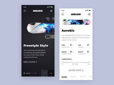
Promo Website for a New Line of Snowboards
Hey guys!
This is a responsive mobile version of a promo website for a new Bataleon snowboards line. The idea was to come up with a top-notch responsive design, keeping all the necessary elements while preserving good UI/UX, so that the website was really user-friendly and could be easily reached on any device.
Goals
Designing a website to promote the company’s new product line in such a way that it appealed to the target audience and adhered to the brand’s aesthetics.
Approach
As the company’s style tends to minimalism, we chose to use Scandinavian style while designing this website. We put all the key information such as board characteristics and video review on the main screen so that users could easily find it. The idea was also to experiment a bit with the composition and come up with some unusual, fresh solutions. To that end, we played with the geometry of the layout and applied golden canon grid which helped us achieve the goal.
Results
You can see above what we ended up with. I’d like to think that it looks pretty clean and gets the job done. Stay tuned! And do let me know what you think of this!
Press :"L" to show some love!
