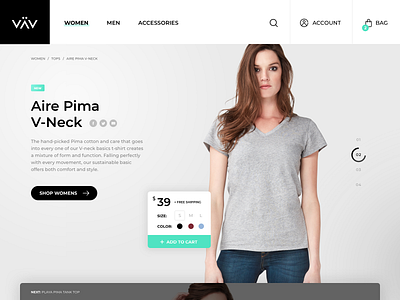
eCommerce homepage redesign concept
Working on a revised design for an eCommerce project. This is the homepage, which is purposely being designed to have similar functionality as a product page to generate sales.
The numbers on the right represent the number of slides below (or products featured on the homepage). As the circle completes, the next slide below slides up. The user can share the item, shop, or add to their cart directly from the homepage.
This is intentionally done instead of using the standard banner image that most eCommerce sites use.
____
Show us love! Press “L”
Want to see more? Check out the Rareview Team for regular updates and don't forget to follow us!
Have a project? Contact us us to collaborate!
More by Chuck Pearson View profile
Like
