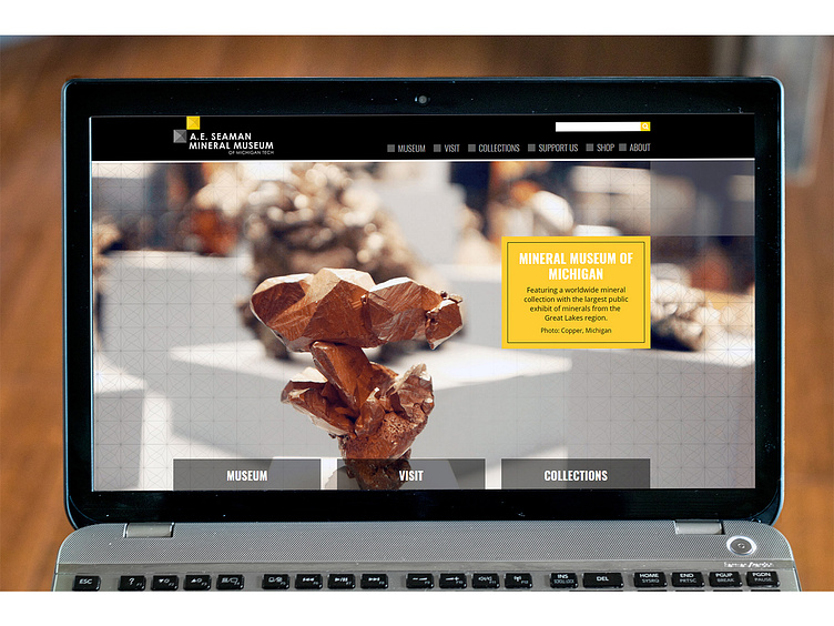
University Mineral Museum Website
Small details can boost a design from 'blah' to 'brilliant.' The texture on the home page slideshow images is an abstract representation of a mineral's crystalline structure, and also ties into the square shapes seen throughout the website (inspired by their new branding).
More by Monte View profile
Like
