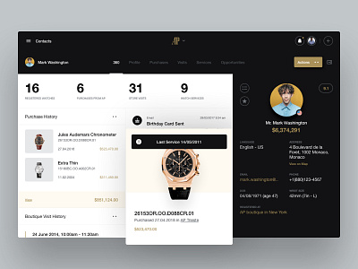
Audemars Piguet - Customer 360 - Exploration #3
Hi everyone,
For this project we partnered with Sugar CRM as their external design team. They shared their insights on Audemars Piguet’s brand, culture and customer base, and ensured we had all we needed to bring our skills and expertise to the solution.
Client
Audemars Piguet is one of the most luxurious and highly sought-after watchmakers in the world, and the only Swiss watchmaker that remains family owned.
Problem
As a traditional brand famed for its high-touch customer service, they needed help to embrace new technology and better connect the refined atmosphere of their boutiques to their digital interface.
Solution
Our goal was to align the user experience with the brand concept, which we achieved by refining and improving user flows on their in-store iPad app, and by giving it a new look and feel that was both modern and responsive. We worked with them to bring the latest technology to the in-store experience, and support their staff to offer the best possible care and attention to customers.
------------
Unfortunately, all this will probably never see the light of the day, as it currently stands the project is dropped like a bag filled with broken dreams :)
Buuut that doesn't mean we can't share all the exploration we did during our design sprint.
------------
This particular screen represents a customer "360" view that showcases dynamic data regarding customer's activities and statuses. For Audemars Piguet, that data revolves around watches, and in particular watch maintenance and services. We wanted to help sale assistants to get the most important data right away, that's why contrasting “power” sidebar was one of the ideas to include to help out with the hierarchy of elements.

