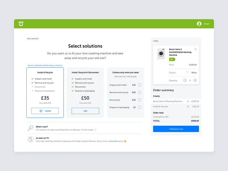
AO Basket – Services Selection Interaction
The concept of AO's basket page, where the user can add services to their order.
I thought it'd be great to have a responsive basket where on the desktop version a card with order details is displayed on the right, and the list of services are on the left side. The main focal point on this page is service selection, so a user can easily compare and choose the right service.
Thanks for watching and please like if you enjoy my work.
___ To comply with a non-disclosure agreement, I have omitted and obfuscated confidential information. The information provided in this concept is my own and doesn’t necessarily reflect the views of AO
More by Anwar Bolat View profile
Like
