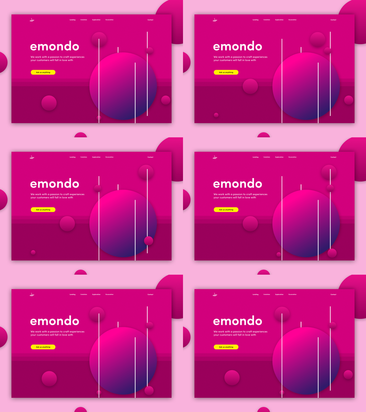
emondo landing
This is the redesigned landing for the company where I work (<3 ).
Our story is themed around space and our very own universe, so all of the landing pages represent different parts of our world. It was a challenge to design the landings to be different but still connected with color and context. It was an even bigger challenge to keep all of the "silly" stuff in the header, while making everything else serious and clean.
The original idea was to have all of the small planets animated between page loads, but the final decision was to make them user interactive for a better feeling of the users belonging with us :)
You can check out the whole website live here https://emondodesign.com/
More by Helena View profile
Like
