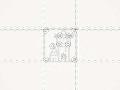
Identity for Museum
This project is from about a half year ago, I forgot to share it. My first and probably last attempt in a logo contest, but since it was for a museum in my home city that needed a redesign I thought I will give it a quick try (nothing special). This is the old logo. I thought about redoing the image of these two buildings with the same thickness to give it a consistent look, and to keep that simplicity I've used the same rounded edges here and there as you see on the pic above. Few projects were on really high level, but you know how the story goes in contests, right?
Click the attachment for full presentation.
More by Milosz Klimek View profile
Like

