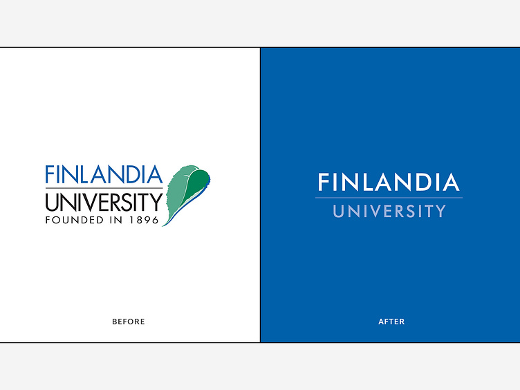
University Logo: Before & After
The new logo uses a modified version of the original typeface, with deliberate spacing that increases legibility at all sizes. The leaf and tagline were removed, and Finlandia was emphasized through contrast and size to make the brand one to remember.
More by Monte View profile
Like
