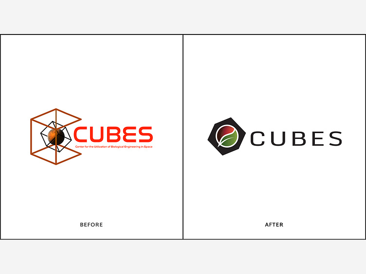
CUBES: Before & After
The new logo not only covers the same bases as the original (a cube, mars, techy font) but also includes a key ingredient the previous logo was missing... any guesses? Hint: the B in CUBES stands for biological. More: http://monte.net/project/mission-logo
More by Monte View profile
Like
