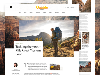
Outside Magazine Article Page
I have worked on all types of projects over the years. I love to stay multidimensional in the type and styles of work I produce. I have to say though, one of my favorite categories of project types is editorial design. There is something about the essence of communicating content within an article, but also building and creating an intriguing design around it with type usage and photography, bridging traditional print media with the web. That is why I loved working so much on this concept for Outside magazine's online website.
This is an example of how the article page could look. I purposely left out all the advertisement placement for a cleaner look for presentation here, but that has been thought through as well.
Be sure to check out the full pixel layout to see all the details. 🌲
I have more pieces from this project to share, so stay tuned to see how other sections and the homepage turned out.
All photography materials have been used only as an example placement only, and all rights belong to the respective owner(s).

