The Navigation Bar
A particular challenge that we faced was the Menu and Navigation Bar for the application.
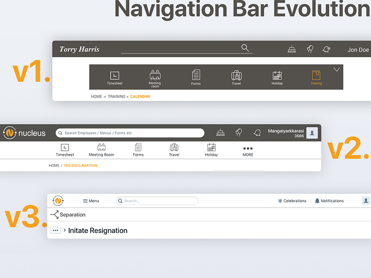
When we started with v1, we envisioned the menu bar to be a separate component which the employee can customize to his/her liking. The navigation bar would consist of a simple search field with individual icons for birthdays, anniversaries and notifications.
During the prototyping stages, we faces technical challenges in implementing the menu bar and also ran into complications about its UX. In the interest of time, rather than re-invent the wheel, we decided to go with the tried and tested, sticky-to-the-top approach where the menu bar is stuck to the navigation bar.
After implementing v2, we ran some user tests and found that there was still room for improvement. Employees complained about the menu and navigation bar taking up all the space in the top leaving very little room for the content below.
With v3, we decided to not only reduce the size of the bars itself, but also fold the menu items into the navigation bar rather than have a separate menu bar. This not only freed up space but also allowed to pull other components up in the hierarchy and enabled us to show a variety of related menus under the main navigation bar.
This version tested very well with the users and has been one of the biggest changes that paid off well in the end with successful iterative design and testing approach.
