Blown Out Font Sampling
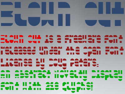
Blown Out is an experiment in communicating letters in abstract forms. Obviously, the middle section is blown out, but not just, as much of the character is missing as possible (along certain guidelines) without making the letters and characters illegible. Since we actually scan texts now (instead of actually read the words), this one makes the reader slow down. Our visual cues are normally taken from the tops (primarily) and bottoms of letters, so we still can read it, surprisingly. I have submitted it to the Google Fonts archive, so it does have the required 218 glyphs, meaning that it offers caps, lowercase, numerals, required accented letters, currency signs, symbols, punctuation. I thought they were going to accept the submission, but they have a backlog of submissions to approve (milestones: Submitted to Google Fonts on April 10th, and Add New Families on Apr 16 {2018}). This one is distributed under the SIL Open Font License as freeware. That means you have lots of options for use (commercial use, as a web font, etc...). Just don't sell it (unless it is included as a bonus in a larger package of fonts), as this is a FREE Font. If you create a new derivative font with it, use a different reserved font name. Credit is not required for this one, but I am always happy to get a link (or even a donation). See the text files included in the archive for more details. Download from my fonts site, Font-Journal... https://www.font-journal.com/fonts/13444/blown_out.php Short Link: http://w3n.us/blownout