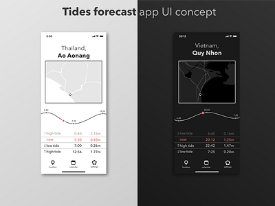
Tides app concept
I am living in Thailand now and go to the beach every morning. Every time before I go, I check whether it's high tide or low tide. Hence this little concept was born. I wanted to make a simple yet easy to use and understand app. I used monochrome color scheme with small red accent to make information easily accessible. Here I used one of my favourite typefaces - Avenir Next. All controls of the app can easily be reached by a thumb of the hand holding an iPhone. In the future I plan to add screens for each menu button and maybe accompanying web-site, which will show information on tides (:
As always, I welcome all critique, likes, comments.
More by Dima Veremchuk View profile
Like
