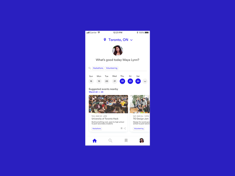
Colours, Accessibility, Old Work
Not really new work but felt the need to post something on here for the sake of posting on here.
Re-opened some old school thesis files of mine. The colours, lack of legibility and readability of some of my work made me want to scream! As a designer, I guess you'll always look back at old work and find some nit-picky things to complain about after the fact. *Design is a continuous process*
__
Here's an updated mock with a bolder accent colour in comparison to the white text on bright green and teal that I originally started with. Oh how I wish I considered a design system to make my life easier.
Haven't touched Dribbble since August! But hoping to post a little more and share some work updates soon :)
More by Samantha Fernandes View profile
Like
