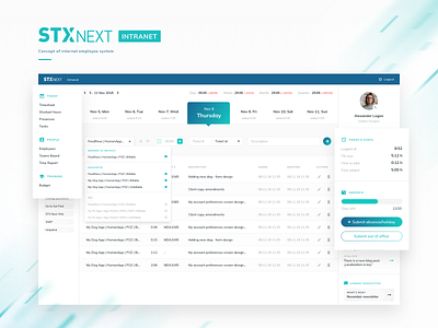
Time Report System Redesign
Hey all!
Ever notice how internal company software tends to be overcomplicated and anything but user-friendly?
Wouldn’t it be nice if it looked neat and pleasant instead?
We figured: why not give it a try?
So we took it upon ourselves to rework and redesign an internal time reporting platform. ⏰🖥
Here’s the concept redesign we came up with.✏️
Do you like it? Share your thoughts with us!
---
Thanks for checking out our stuff!
Feeling inspired? Get in touch!
We’re available for new projects
ux@stxnext.com.
Want to join the team? Let us know!
We’re always on the lookout for new talent at STX Next.
More by STX Next View profile
Like

