vuur & vorm – logo option 2
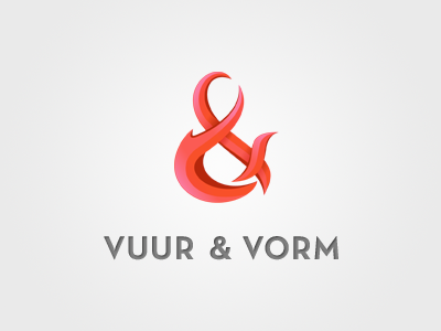
This will be the name and logo for my new portfolio website that I'm currently working on. I'm not decided on the font color. Red fits well, but might take away from the ampersand mark. This is the second option; grey (50% black).
Some info on the name: it's Dutch for "fire & form", which is a play on the expression or phrase "in vuur & vlam staan", somewhat comparable to "to be on fire" (the word "vlam" meaning "flame"). The original meaning of the expression is 'to be (very) enthusiastic'.