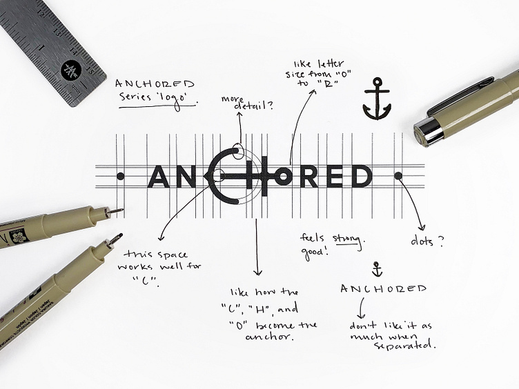
Anchored Logo
A little logo with some exploration thoughts.
This one was created for a small series logo. In any case, it was super fun to explore how the anchor could work with the type and be incorporated into the type. ⠀⠀⠀⠀⠀⠀⠀⠀⠀ We initially created a version with just the “H” and “o” as the anchor, but found this version way more visually cohesive and clear. ⠀⠀⠀⠀⠀⠀⠀⠀⠀ After we landed on this version, we then dove into the details of making sure it all felt balanced, had the correct type weight, and was both legible to the word as well as the imagery included. ⚓️
More by Highlo Designs View profile
Like
