WhatsApp Icon
WhatsUp?
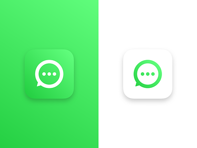
Another quick icon and logo adaption, this time WhatsApp. Their current icon is ok I guess, I think it’s clever how they have made it look like the Apple phone icon.
But the use of a phone is terrible, it’s an old style phone and makes little sense. I’ve spent around an hour and half creating the new icon, which is geometrically more accurate than their current mark.
Producing redesigns is fun, even if only a few small things have changed. All the icon designs I am doing are just for fun, I consider it good practise to quickly try and improve something.
If you are going to redesign something, it does not have to completely change or be overly complicated.