Brighter
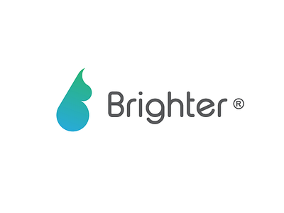
Logomark design for a car wash brand.
.
Escaping the classical and cliche car silhouetes and creating something inspiring and creative was a must.
.
My idea is combining a drop of water & oil with the letter B.
The color palette highlights the oil and water elements.
.
Click here to see more
https://www.instagram.com/p/Bp4mBAWBs3I/
.
Need a logo / brand Identity? 📩
DM / Email brainstormcontacts@gmail.com
More by Filip Panov View profile
Like
